Accordion
Summary
A component that allows multiple open/close accordions and option to add content when opened. You may also add images, text, links, & etc inside content section as html. Click here to see this component live.
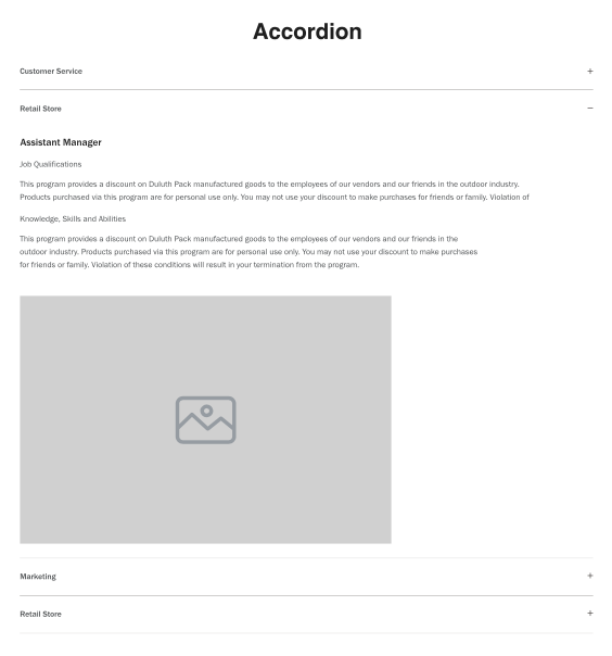
Display
Desktop
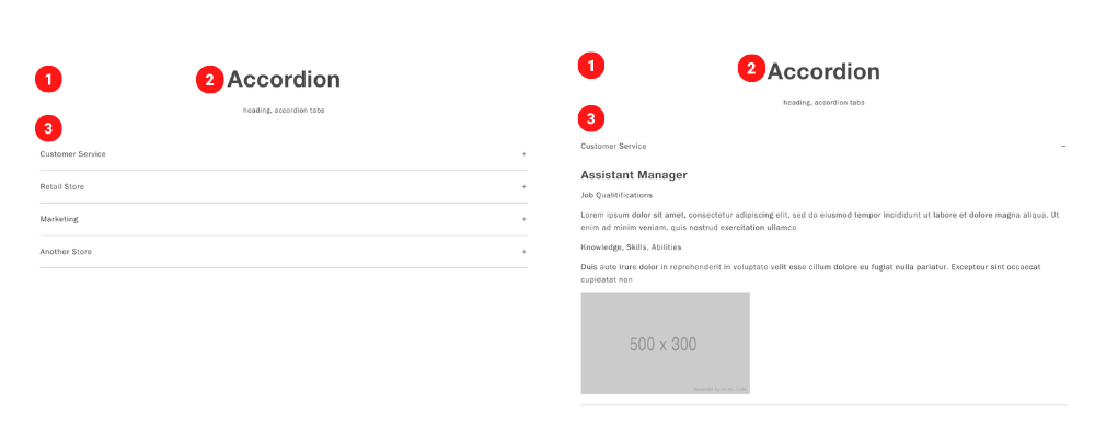 Desktop Image size 500 x 300
Tablet
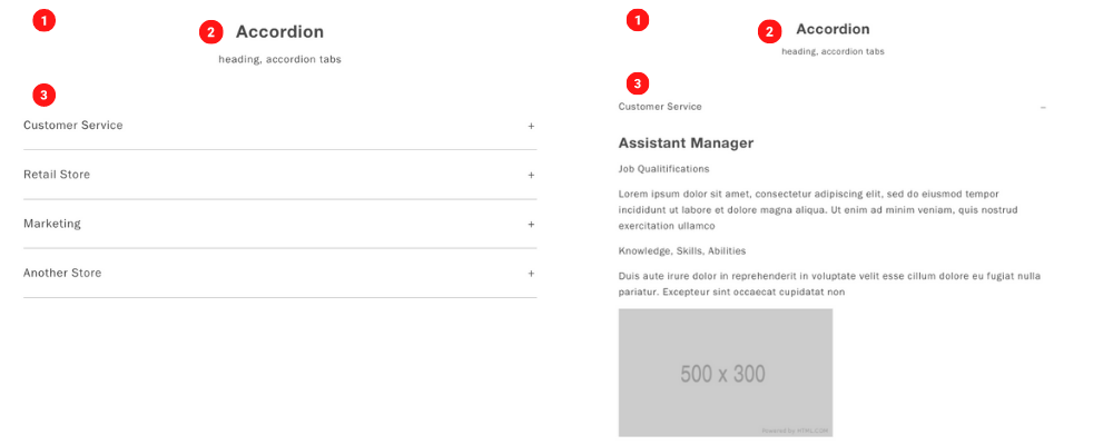 Tablet Image size 500 x 300
Mobile
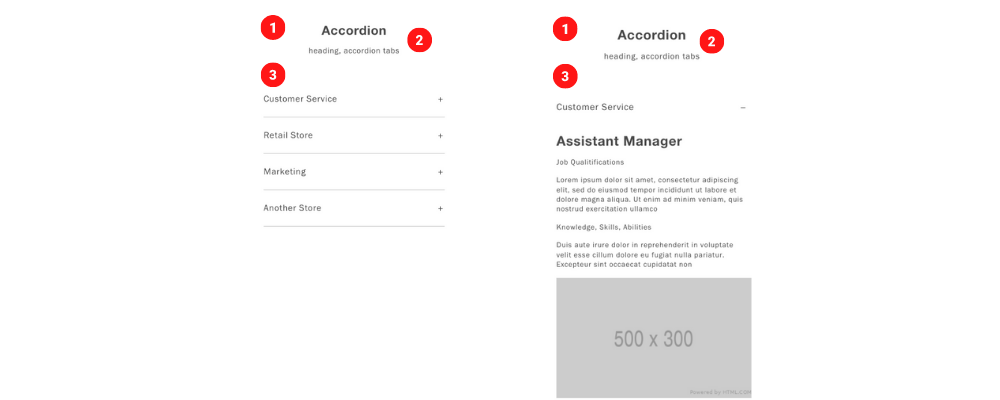 Mobile Image size 500 x 300
Create Component
Steps:
1. Check layout and click View/Edit Layout.
2. Click + Add New Component.
3. Select Container.
4. Enter component name and component code.
5. Set component as Active.
6. Enter following inputs in admin.
7. Select ••• and click Add Child.
8. Select Section Header.
9. Follow step 7 and select Accordion.
Attention
Component code should be unique to each component.
Admin Display
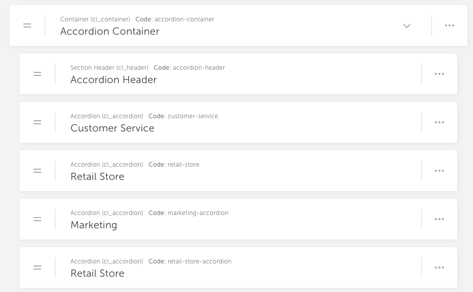
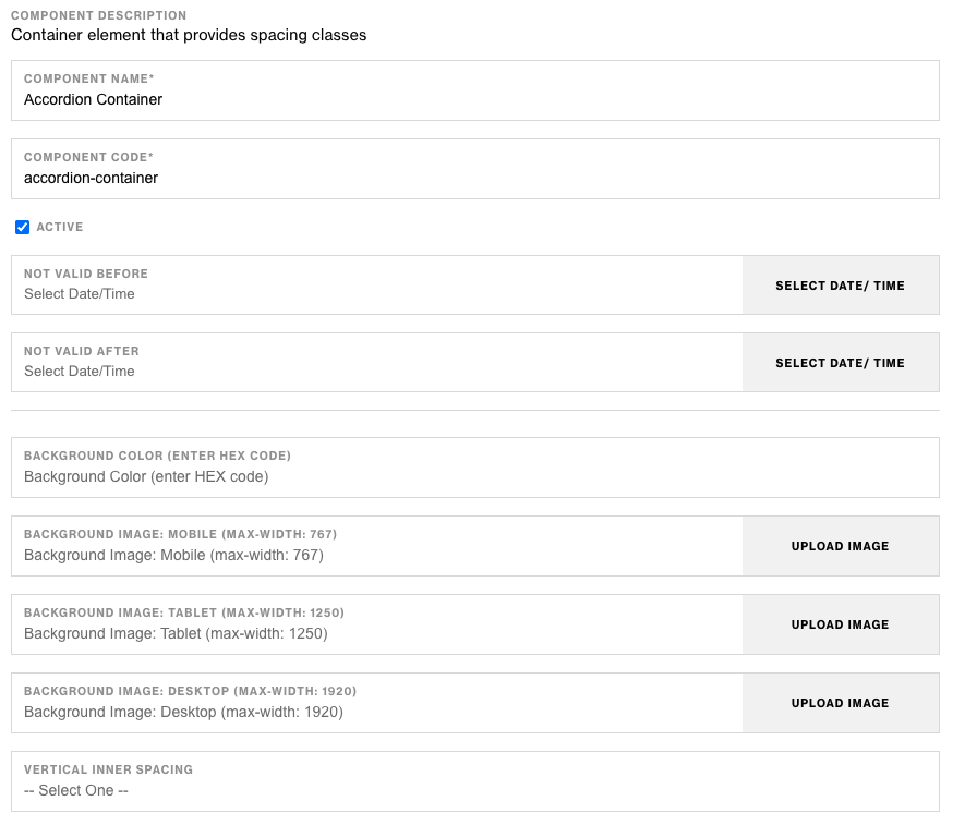
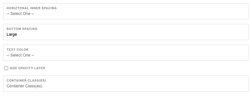
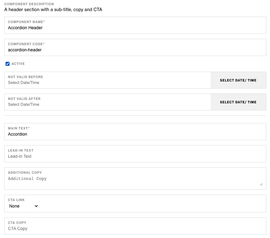

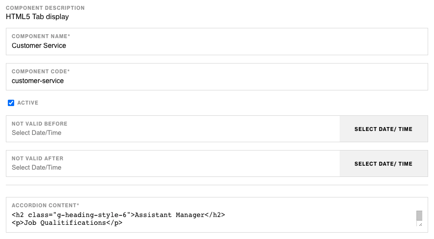
Components & Component Attributes
Container Component
| Attribute | Description | Required |
|---|---|---|
| Bottom Spacing | Adds spacing at the bottom. | No |
Section Header Component
| Attribute | Description | Required |
|---|---|---|
| Main Text | Header text | Yes |
| Lead-in Text | Text below header | No |
| Text Alignment | Aligns all text content | No |
Accordion Component
| Attribute | Description | Required |
|---|---|---|
| Accordion Content | Add any content inside accordion | Yes |
Notes
Notes
These components have more attributes & selections but the main ones to create the current example are listed above
To build longer Accordions, add multiple Accordion child components to the parent Container Component.
In the content section of the Accordion Component, use HTML for any link, text, image, & etc.
Components can be set to hide or show using Not Valid Before & Not Valid After.
Default
Default
If left unselected, Section Header Component's Main CTA Style defaults to Link.