Container
Summary
A high-level component used primarily for spacing. Anything can be nested inside of a container.
Display
Create Component
Steps:
1. Check layout and click View/Edit Layout.
2. Click + Add New Component.
3. Select Container.
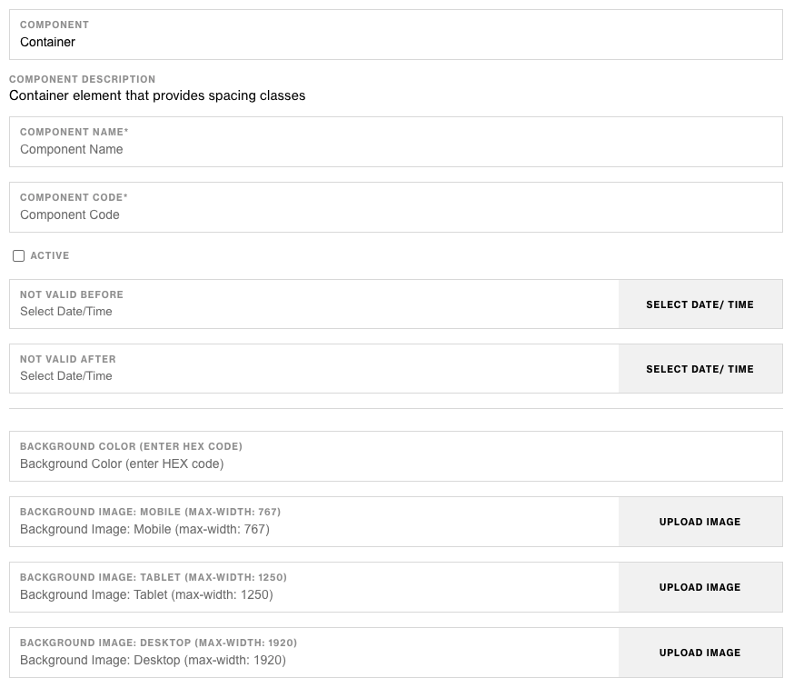
4. Enter component name and component code.
5. Set component as Active.
6. Enter following inputs in admin.
Attention
Component code should be unique to each component.
Admin Display


Component Attributes
| Attribute | Description |
|---|---|
| Background Color | Add a background color to the container element |
| Responsive Background Images | Add a background image to the container element |
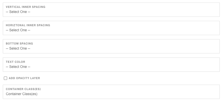
| Vertical Inner Spacing | Add vertical padding (inside space) to the container |
| Horizontal Inner Spacing | Add horizontal padding (inside space) to the container |
| Bottom Spacing | Add bottom spacing (outer space) to the container. Commonly used to add spacing between elements. |
| Text Color | Determine the text color of the container using provided colors. |
| Layer Opacity | Add an opacity layer above the image and behind the text color. Used to add more contrast to the container's copy. |
| Container Classes | Assign custom classes to the container |
Notes
Note
Components can be set to hide or show using Not Valid Before & Not Valid After.
Default
Default