Divided Hero Banner
Summary
A divided hero banner consists of two sides. One side has a large image with CTA while the second side has text with optional color or image background and CTA. It also has ability to reverse layout and add a container for extra padding on larger screens. Click here to see this component live.
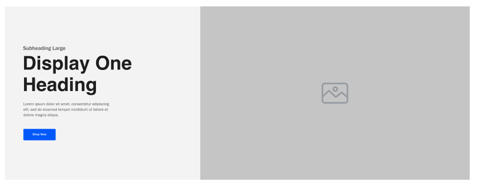
Display
Desktop
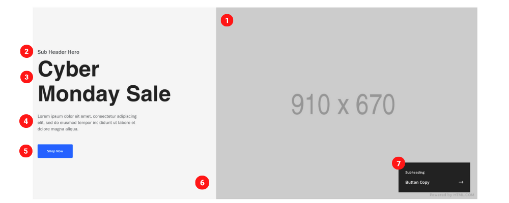 Desktop Image size 910 x 670 pixels & 130 KB
Tablet
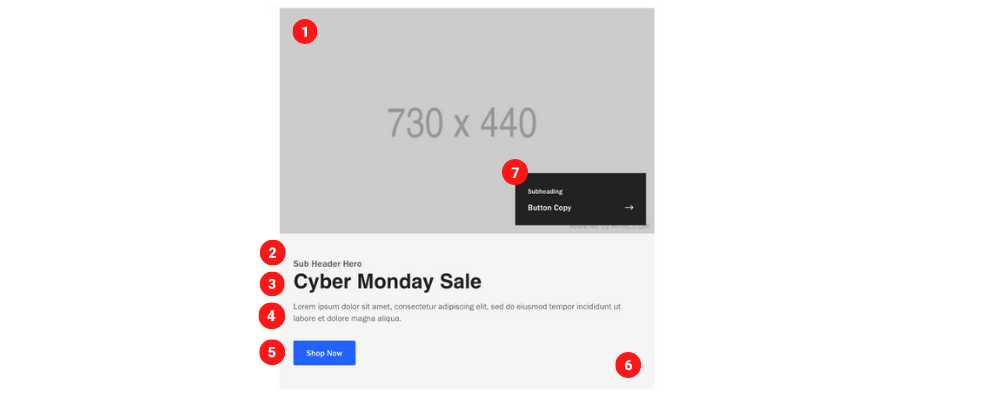 Tablet Image size 730 x 440 pixels & 70 KB
Mobile
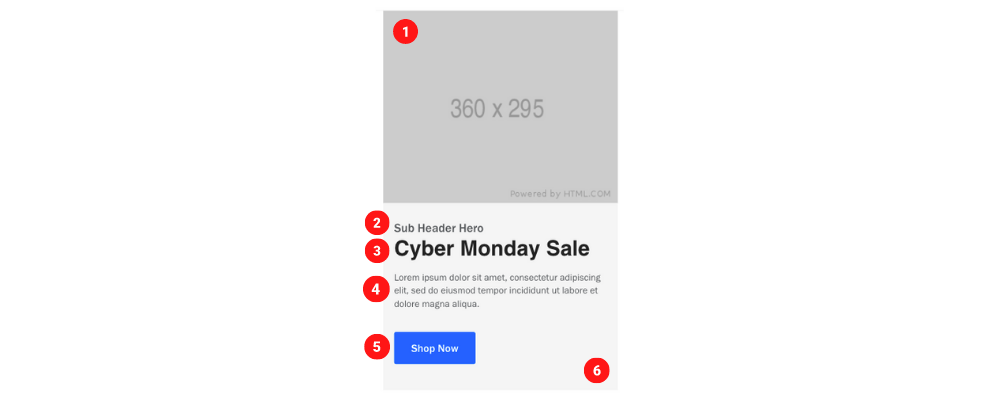 Mobile Image size 360 x 295 pixels & 130 KB
Create Component
Steps:
1. Check layout and click View/Edit Layout.
2. Click + Add New Component.
3. Select Divided Hero Banner.
4. Enter component name and component code.
5. Set component as Active.
6. Enter following inputs in admin.
Attention
Component code should be unique to each component.
Admin Display
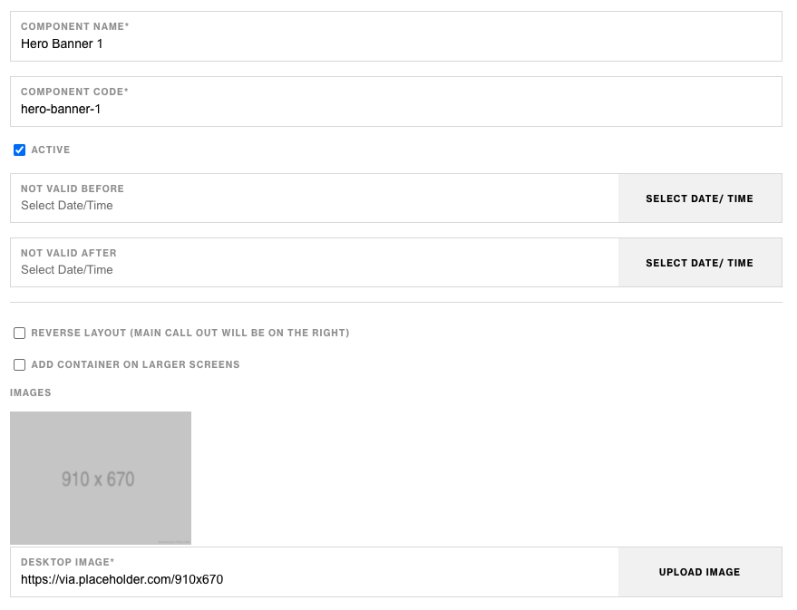
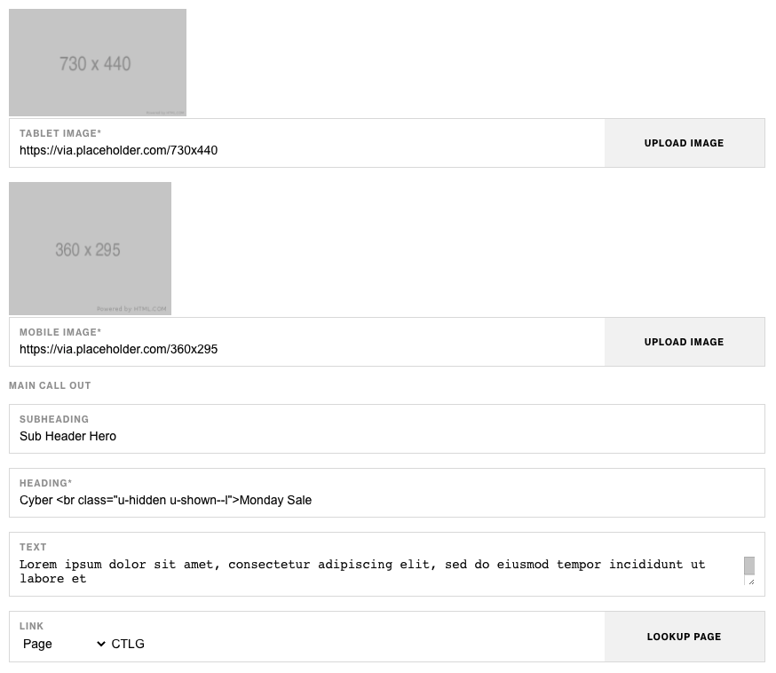
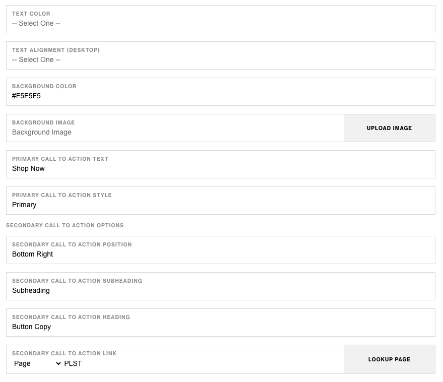
Component Attributes
| Attribute | Description | Required |
|---|---|---|
| Reverse layout (Main CTA will be on right) | Checkbox to reverse the layout | No |
| Add container on large screens | Add a wrapping container to component on larger screens | No |
| Desktop Image | Choose an image for desktop | Yes |
| Tablet Image | Choose an image for tablet | Yes |
| Mobile Image | Choose an image for mobile | Yes |
| Main Callout: Subheading | Text content at the top | No |
| Main Callout: Heading | Heading text below subheading | Yes |
| Main Callout: Text | Text content below heading | No |
| Main Callout: Link | CTA Link | No |
| Main Callout: Text Color | Text color | No |
| Main Callout: Text Alignment Desktop | Text content alignment on desktop | No |
| Main Callout: Background Color | Choose a background color | No |
| Main Callout: Background Image | Choose a background image | No |
| Main Callout: Primary CTA Text | CTA text content | No |
| Main Callout: Primary CTA Style | CTA text style | No |
| Secondary CTA Position | Choose position of secondary CTA button | No |
| Secondary CTA Subheading | Secondary CTA text content | No |
| Secondary CTA Heading | Secondary CTA heading text | No |
| Secondary CTA Link | Secondary CTA link | No |
Notes
Notes
If both images and background color for the text side has values, color will take precidense over background.
Background color value should be in Hex Code ex. #FFFFFF.
Secondary CTA is hidden on mobile.
Components can be set to hide or show using Not Valid Before & Not Valid After.
Default
Default
If left unselected, Main CTA Style defaults to Primary.