Forms
Summary
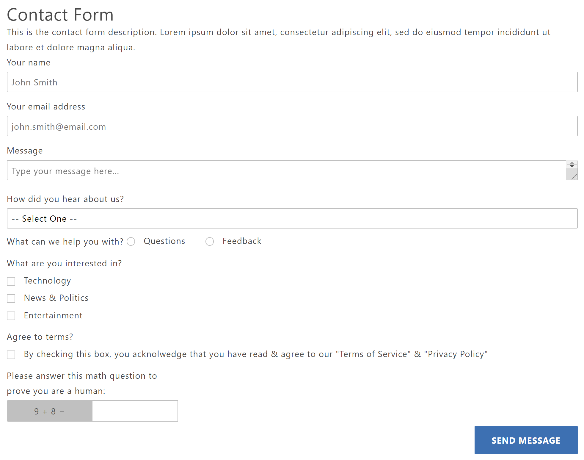
Several C&L components have been built that allow store-owners to create & modify forms on their site. They are geared towards collecting information provided by customers, like for: contact forms, catalog request forms, dealer-applications, feedback surveys, RMA request forms, etc.
The forms can be added to any of the pages that use the Components & Layouts layout_load_components feature which is typically setup on the SFNT, CTUS, ABUS, PRPO, & SARP pages. See the Sample Setup below for more technical details about how to add this to a store.
Customers can create forms that take optional or required inputs: text, textarea, radio-buttons, checkboxes, and dropdowns. They also include an option simple-math-problem for filtering out bot/spam submissions. It does not include file/image uploads.
Display
Click here to try out a demo form
Note
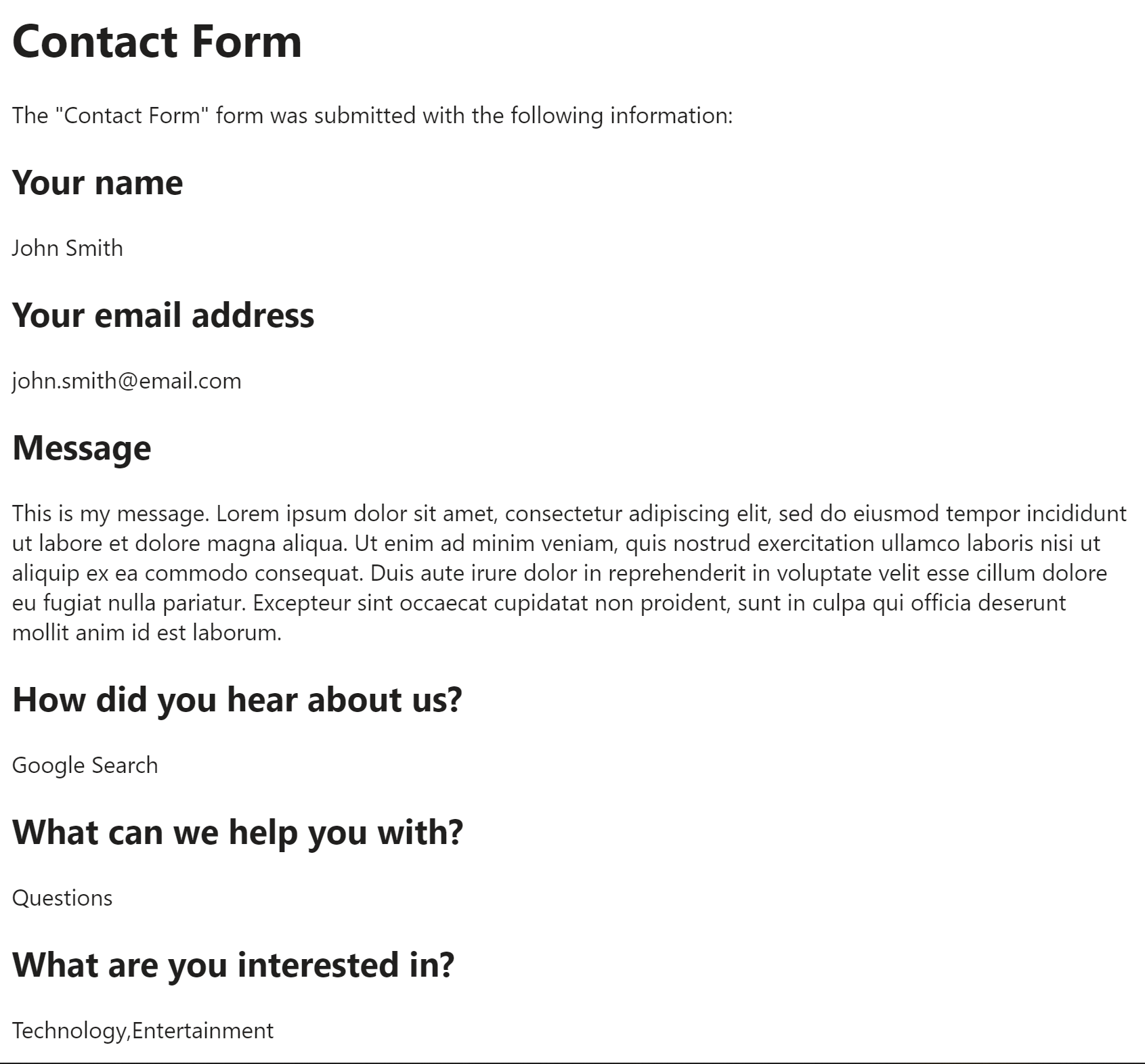
Once the form is filled out, it will send an email to the whomever you choose that outputs the information the customer provided:
Create Component
Steps:
1. Check layout and click View/Edit Layout.
2. Click + Add New Component.
3. Select Form.
4. Enter component name and component code.
5. Set component as Active.
6. Enter following inputs in admin.
7. Select ••• and click Add Child.
8. Select Form Input.
9. Enter following inputs in admin.
10. Select ••• on Form and click Add Child.
11. Select Form Choice.
12. Enter following inputs in admin.
Attention
Component code should be unique to each component.
Component Attributes
Form Component (cl_form)
cl_form Admin Display
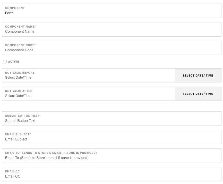

cl_form Component Attributes
Name A name is required for all C&L components and it will be used as the title/name/heading used to identify and summarize the purpose of your form. In the example form above it is set to "Contact Form". Description This is where you can write additional details about the form to help the customer fill out the form. It will display below the title. In the example form above it is set to "This is the form description. Lorem ipsum...". Required: No Type: Text Input Code: title Submit Button Text This is going to be the text of the form's final submit button. In the example form aboveit is set to "Send Message" Required: Yes Type: Text Input Code: submit_button_text Email To Enter the email address(es) that you would like to send the details of the filled-out form to (ex. [email protected]) Required: No Default: The Store's Email (ex. `g.Store:email`) Type: Text Input / Email-Address Format Code: email_to Email CC Optionally, enter the email address(es) that you would like to send the details of the form to as a CC recipient (ex. [email protected]) Required: No Type: Text Input Code: email_cc Email Subject Enter the subject line that you would like the email to have when the form is submitted. Required: Yes Type: Text Input Code: email_subject Success Message This is the message that will display to the customer after they have successfully fill-out and submitted the form. Typically this is a great place to thank them for their information & clarify when you intend to follow up with them. Required: Yes Type: Text Input Code: success_message Validate Math Problem? Check this box if you would like to display a simple math problem to the customer to prove that they are human. This is helpful for filtering out spam/bot submissions. The math problem will generate two random numbers less-than 10, and ask customers to enter the sum of the two numbers (ex. "What is 3 + 4?" Expected answer: 7) Required: No Type: Checkbox Code: validate_math_problemAttention
When creating a custom form, start by creating the required/wrapping cl_form component. It needs to be the direct-parent of the cl_form_input & cl_form_choice components.
Form Input Component (cl_form_input)
cl_form_input Admin Display
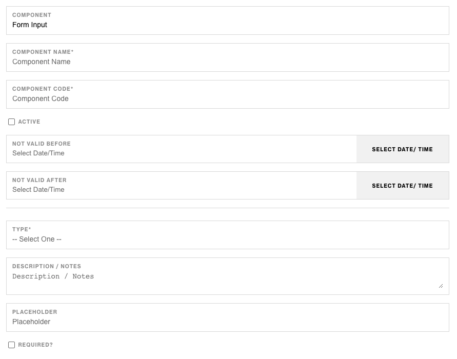
cl_form_input Component Attributes
Name A name is required for all C&L components and it will be used as the label/prompt of the input. Type Here is where you can select the input-type for the information you would like people to enter. Required: Yes Type: Select Code: type Options:- Text
- Textarea (i.e. message)
- Number
- Password
- Tel (i.e. Phone number)
- Datetime-Local (i.e. Date)
Attention
This component is used to gather custom textual information from a customer. It could be their name, email, a message, etc.
In order for this to work, it must be placed inside of a cl_form component as a direct-child-component of the cl_form component.
Form Choice (cl_form_choice)
cl_form_choice Admin Display
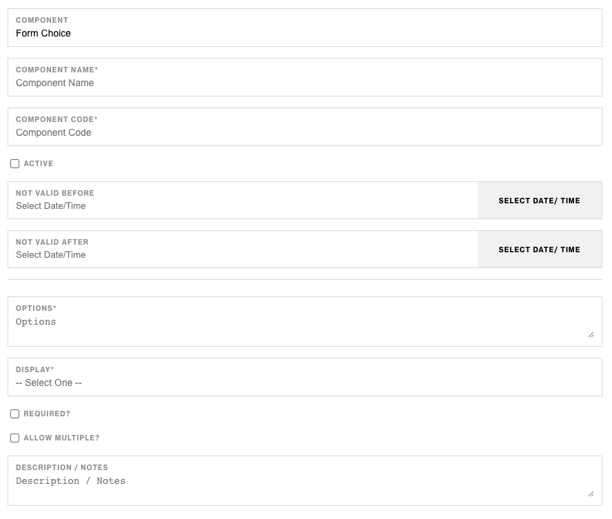
cl_form_choice Component Attributes
Name A name is required for all C&L components and it will be used as the label/prompt of the input. Options This is where you list out the options that you would like the customer to choose from. Each line represents one option/selection that people can make. For example, to create three options to gather people's interests you would list each option on their own line like this:Technology
News & Politics
Entertainment
- dropdown - Displays the options in a select dropdown menu.
- inline - Displays radio or checkbox options in an horizonal/inline list.
- block - Displays radio or checkbox options in a vertical/block list.
- When used in combination with the "Display" of dropdown, this will render a select multiple input.
- When used in combination with the "Display" of block or inline, this will render several radio inputs (i.e. input type="radio")
Attention
This component is used to gather the choices that customers make from a pre-determined list of options. It can display a select-dropdown list, radio buttons, or checkboxes depending on how the display and allow_multiple options are configured.
In order for this to work, it must be placed inside of a cl_form component as a direct-child-component of the cl_form component.
Sample Setup
Import the Components
- Download the
cl-form__components.xmlimport file - Open the Miva Admin & navigate to Data Management
- Choose the "Import Data and Settings in XML Provisioning Format" option
- Upload and trigger the import for the
cl-form__components.xmlimport file.
Import/Create the Layout
- You can use an existing layout & manually add the form components to it, or you can import this sample CTUS form:
- Download the
cl-form__example-layout.xmlimport file - Open the Miva Admin & navigate to Data Management
- Choose the "Import Data and Settings in XML Provisioning Format" option
- Upload and trigger the import for the
cl-form__example-layout.xmlimport file.
Sample Page Content
Note
This step may be optional if your CTUS page is already configured to use the C&L page-layout that recursively renders components.
Now that the store has the cl_form components & your have a layout that is configured to use those components, you can render the form wherever you want it to display using the layout_code you added the form to and the layout_load_components RT Content Section.
<mvt:assign name="l.settings:layout_code" value="'ctus'" />
<mvt:item name="readytheme" param="contentsection( 'layout_load_components' )" />
