Full Width Hero Banner
Summary
A full width hero banner with image background, text, and CTA. Click here to see this component live.
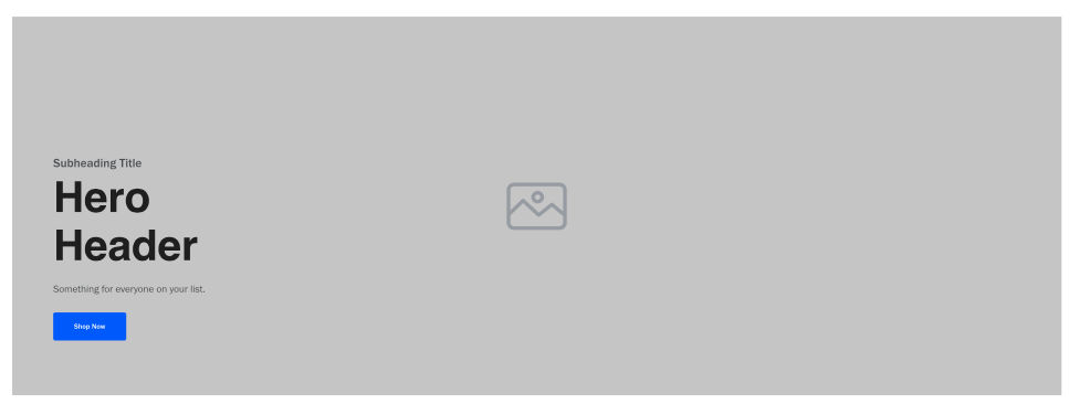
Display
Desktop
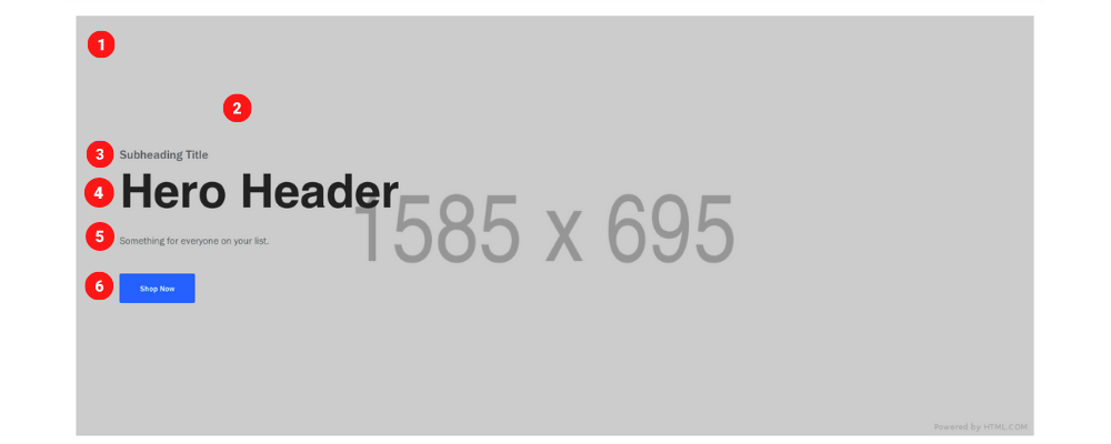 Desktop Image size 1585 x 695 pixels & 230 KB
Tablet
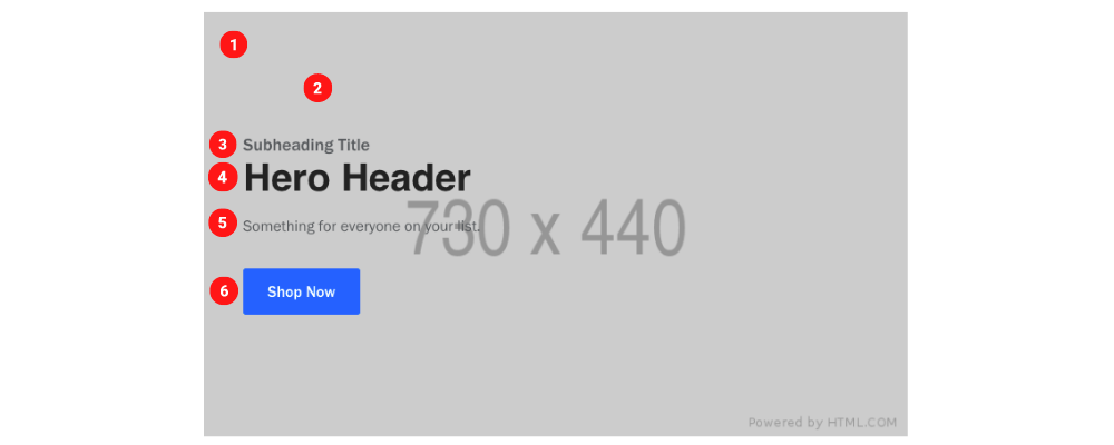 Tablet Image size 730 x 440 pixels & 70 KB
Mobile
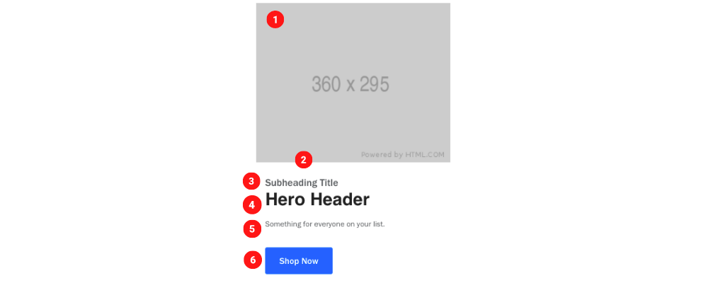 Mobile Image size 360 x 295 pixels & 25 KB
Create Component
Steps:
1. Check layout and click View/Edit Layout.
2. Click + Add New Component.
3. Select Full Width Hero Banner.
4. Enter component name and component code.
5. Set component as Active.
6. Enter following inputs in admin.
Attention
Component code should be unique to each component.
Admin Display
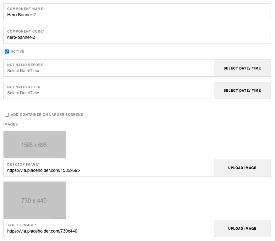
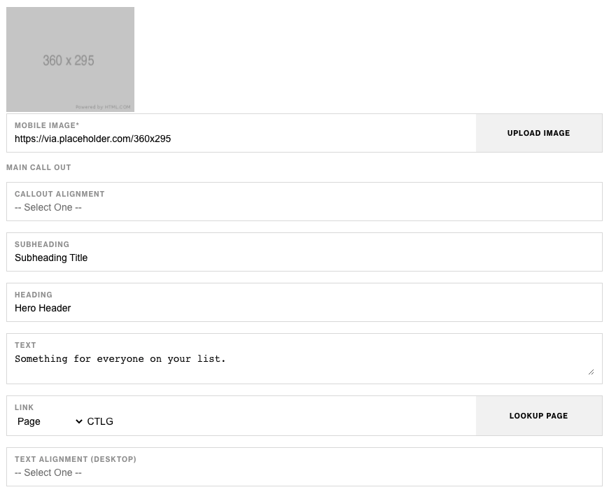

Component Attributes
| Attribute | Description | Required |
|---|---|---|
| Add container on large screens | Add a wrapping container to component on larger screens | No |
| Desktop Image | Choose an image for desktop | Yes |
| Tablet Image | Choose an image for tablet | Yes |
| Mobile Image | Choose an image for mobile | Yes |
| Main Callout: Call Out Alignment | Align call out content | No |
| Main Callout: Subheading | Text content at the top | No |
| Main Callout: Heading | Heading text below subheading | No |
| Main Callout: Text | Text content below heading | No |
| Main Callout: Link | CTA Link | No |
| Main Callout: Text Alignment Desktop | Aligning text on desktop | No |
| Main Callout: Text Color While Overlayed | Choose text color while overlayed | No |
| Main Callout: Primary CTA Text | CTA text content | No |
| Main Callout: Primary CTA Style | CTA text style | No |
Notes
Notes
Secondary CTA is hidden on mobile.
Components can be set to hide or show using Not Valid Before & Not Valid After.
Default
Default
If left unselected, Main CTA Style defaults to Primary.