Image Item
Summary
Image element with ability to specifiy various images for mobile, tablet, & desktop sized. Can also be used within a Carousel to create a slider.
Display


Create Component
Steps:
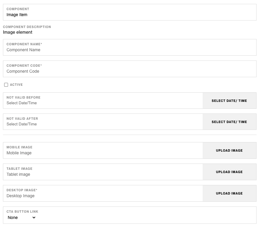
1. Check layout and click View/Edit Layout.
2. Click + Add New Component.
3. Select Image Item.
4. Enter component name and component code.
5. Set component as Active.
6. Enter following inputs in admin.
Attention
Component code should be unique to each component.
Admin Display


Component Attributes
| Attribute | Description | Required |
|---|---|---|
| Mobile Image | The image to display on mobile devices and screen sizes | No |
| Tablet Image | The image to display on tablet devices and screen sizes | No |
| Desktop Image | The image to display on desktop devices and screen sizes | Yes |
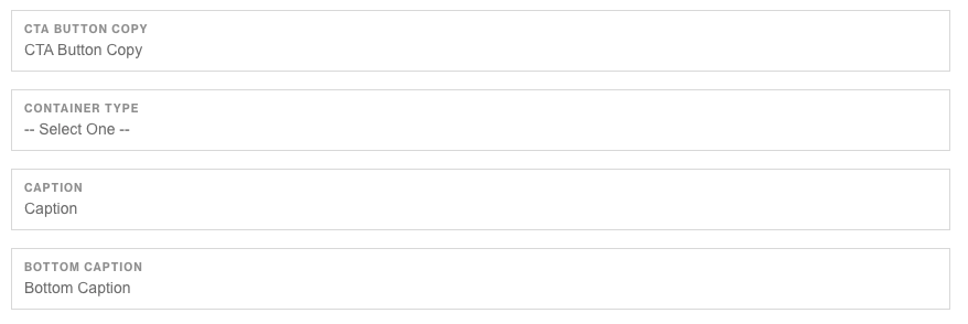
| CTA Link | Allows you to display a CTA button link below the image | No |
| CTA Copy | The copy to display in the CTA button | No |
| Container Type | The container type for the image container (based on Elements framework) | No |
| Caption | Additional copy | No |
| Bottom Caption | Additional copy | No |
Notes
Notes
Components can be set to hide or show using Not Valid Before & Not Valid After.
Default
Default