Promo Bar
Summary
A skinny banner usually placed at the top of a layout. It also has ability to add a background image or color. If linked, the entire container will be clickable. Click here to see this component live.

Display
Desktop
 Desktop image size: 1580 x 55 pixels & 20 KB
Tablet
 Tablet image size: 720 x 55 pixels & 10 KB
Mobile
 Mobile image size: 360 x 90 pixels & 10 KB
Create Component
Steps:
1. Check layout and click View/Edit Layout.
2. Click + Add New Component.
3. Select Promo Bar.
4. Enter component name and component code.
5. Set component as Active.
6. Enter following inputs in admin.
Attention
Component code should be unique to each component.
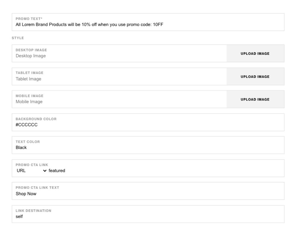
Admin Display


Component Attributes
| Attribute | Description | Required |
|---|---|---|
| Promo Text | Main text content | Yes |
| Desktop Image | Choose a background image for container on desktop | No |
| Tablet Image | Choose a background image for container on tablet | No |
| Mobile Image | Choose a background image for container on mobile | No |
| Background Color | Choose a color for background of container | No |
| Text Color | Choose a color for text content | No |
| Promo CTA Link | Add a link to CTA button | No |
| Promo CTA Text | The copy to display in the CTA button | No |
| Link Destination | Option to open link to a new page or not | No |
Notes
Notes
If both images and background color for the text side has values, color will take precidense over background.
Background color value should be in Hex Code ex. #FFFFFF.
Components can be set to hide or show using Not Valid Before & Not Valid After.
Default
Default