Promotional Card
Summary
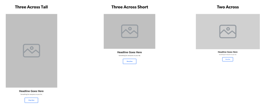
A component mostly used as a child component to build things like Side by Side Promotional Row or Four Across Row, typically used to promote products or categories. Including headline, text, & CTA's under image. Click here to see this component live.
Display
Desktop / Tablet / Mobile
 Image sizes 760 x 420, 495 x 335, 490 x 710
Create Component
Steps:
1. Check layout and click View/Edit Layout.
2. Click + Add New Component.
3. Select Promotional Card.
4. Enter component name and component code.
5. Set component as Active.
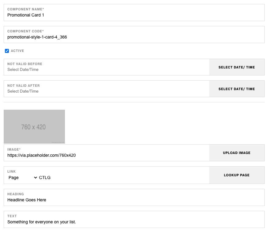
6. Enter following inputs in admin.
Attention
Component code should be unique to each component.
Admin Display


Component Attributes
| Attribute | Description | Required |
|---|---|---|
| Image | The image that will be displayed for the component | Yes |
| Link | The link for the image and CTA button | No |
| Heading | Header text below image | No |
| Text | Text copy below header | No |
| CTA Text | The copy to display in the CTA button | No |
| CTA Style | The style of the CTA button to apply | No |
Notes
Notes
The link input in the Promotional Card component will also be used as the CTA link.
If looking to use 2-3 Promotional Card Components consider using Side by Side Promotional Row Component.
To build Four Across Row make sure to add (4) Promotional Card components as children.
Components can be set to hide or show using Not Valid Before & Not Valid After.
Default
Default
If left unselected, Promotional Card Component's CTA Type defaults to Link style.