Promo Grid 1 + 2
Summary
A group of 3 images arranged into one large image with two smaller images. Split into two columns (66% / 33%). Each image has option to use CTA & text. Also has ability to reverse layout and add a container for extra padding on larger screens. Click here to see this component live.
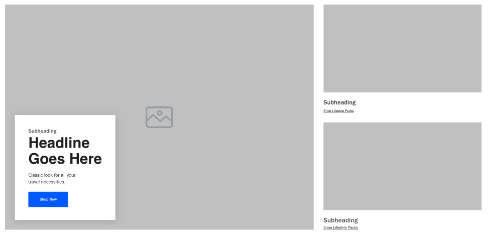
Display
Desktop
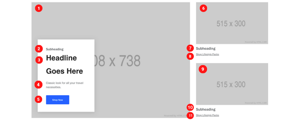 Main image size: 1008 x 738 pixels & 160 KB
Top & Bottom image size: 515 x 300 pixels & 35 KB
Tablet
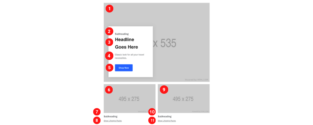 Main image size: 715 x 535 pixels && 85 KB
Top & Bottom image size: 495 x 275 pixels && 30 KB
Top & Bottom image size: 495 x 275
Mobile
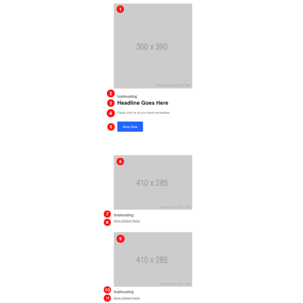
Main image size: 360 x 390 pixels & 25 KB
Top & Bottom image size: 410 x 285 pixels & 25 KB
Create Component
Steps:
1. Check layout and click View/Edit Layout.
2. Click + Add New Component.
3. Select Editorial Grid.
4. Enter component name and component code.
5. Set component as Active.
6. Enter following inputs in admin.
Attention
Component code should be unique to each component.
Admin Display
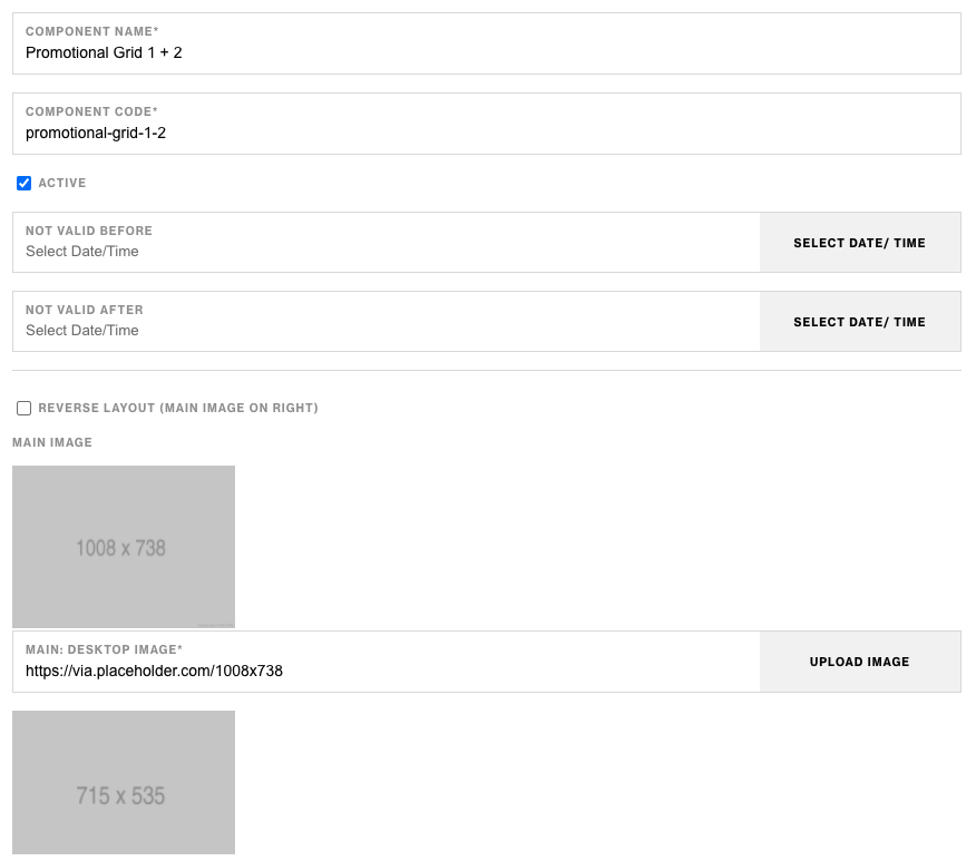
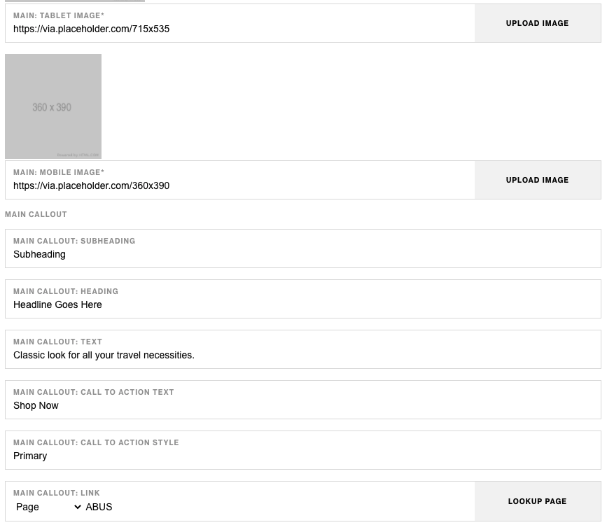
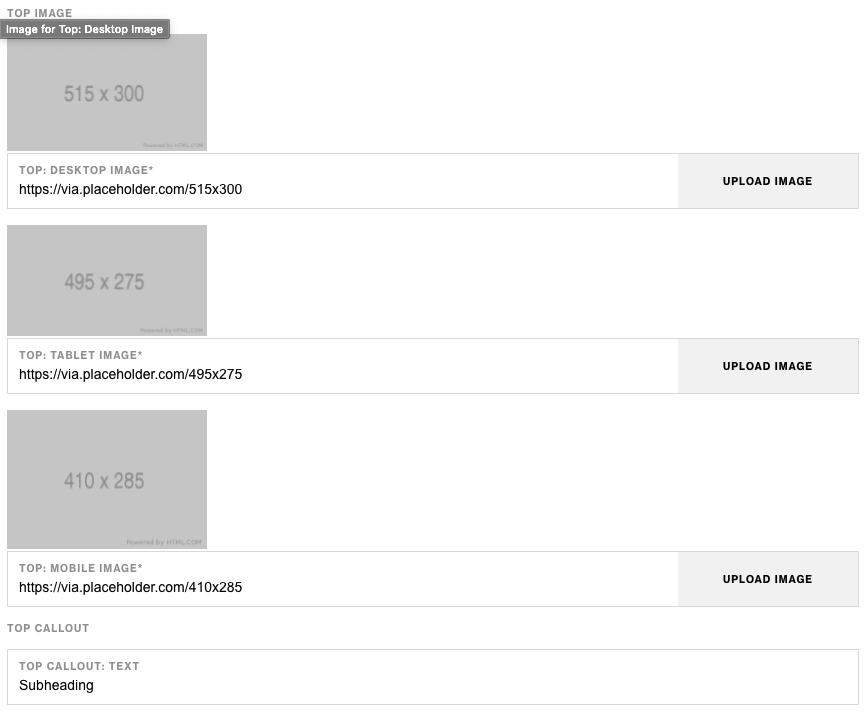
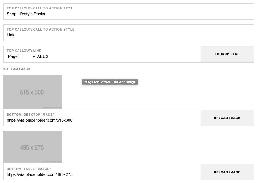
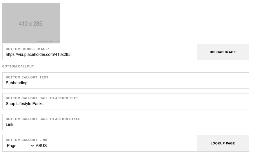
Component Attributes
| Attribute | Description | Required |
|---|---|---|
| Add container on large screens | Checkbox to add a wrapping container on the component for larger screens | No |
| Main Image Desktop | Choose an image for the larger image on desktop | Yes |
| Main Image Tablet | Choose an image for the larger image on tablet | Yes |
| Main Image Mobile | Choose an image for the larger image on mobile | Yes |
| Main Callout: Subheading | Text content at the top | No |
| Main Callout: Heading | Heading text below subheading | No |
| Main Callout: Text | Text content below heading | No |
| Main Callout: CTA Text | CTA text content | No |
| Main Callout: CTA Style | CTA text style | No |
| Main Callout: CTA Link | CTA text link | No |
| Top Image Desktop | Choose an image for the top image on desktop | Yes |
| Top Image Tablet | Choose an image for the top image on tablet | Yes |
| Top Image Mobile | Choose an image for the top image on mobile | Yes |
| Top Callout: Subheading | Text content at the top | No |
| Top Callout: Heading | Heading text below subheading | No |
| Top Callout: Text | Text content below heading | No |
| Top Callout: CTA Text | CTA text content | No |
| Top Callout: CTA Style | CTA text style | No |
| Top Callout: CTA Link | CTA text link | No |
| Bottom Image Desktop | Choose an image for the bottom image on desktop | Yes |
| Bottom Image Tablet | Choose an image for the bottom image on tablet | Yes |
| Bottom Image Mobile | Choose an image for the bottom image on mobile | Yes |
| Bottom Callout: Subheading | Text content at the top | No |
| Bottom Callout: Heading | Heading text below subheading | No |
| Bottom Callout: Text | Text content below heading | No |
| Bottom Callout: CTA Text | CTA text content | No |
| Bottom Callout: CTA Style | CTA text style | No |
| Bottom Callout: CTA Link | CTA text link | No |
Notes
Notes
Images will also be clickable and linked to the corresponding CTA link.
Components can be set to hide or show using Not Valid Before & Not Valid After.
Default
Default
If left unselected, Promo Grid 1+2's Top Callout CTA Style & Bottom Callout Style defaults to Link.