Side By Side Promotional Row
Summary
A component with 2 or 3 promotional images normally used to promote products or categories. Includes headline, text, & CTA's under each image. Also has ability to add background color to Side by Side component & option to turn component into a slider on mobile. Click here to see this component live.
Display
Desktop
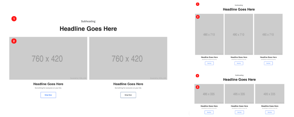 Desktop Image sizes 760 x 420, 495 x 335, 490 x 710
Tablet
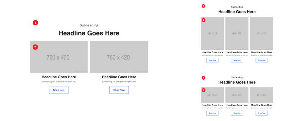 Tablet Image size 760 x 420, 495 x 335, 490 x 710
Mobile
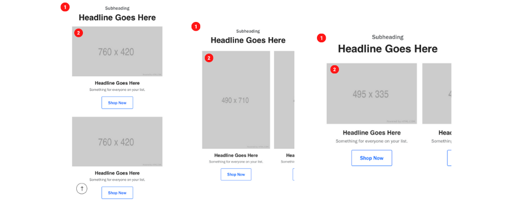 Mobile Image size 760 x 420, 495 x 335, 490 x 710
Create Component
Steps:
1. Check layout and click View/Edit Layout.
2. Click + Add New Component.
3. Select Side By Side Promotional Row.
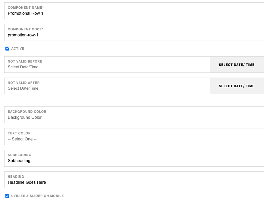
4. Enter component name and component code.
5. Set component as Active.
6. Enter following inputs in admin.
7. Select ••• and click Add Child.
8. Select Promotional Cards.
9. Follow step 7-8 until you have 2 or 3 Promotional Cards.
Attention
Component code should be unique to each component.
Admin Display
 With 2 Promotional Cards
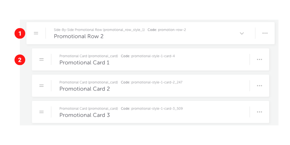 With 3 Promotional Cards

Components & Component Attributes
Side By Side Promotional Row
| Attribute | Description | Required |
|---|---|---|
| Utilize a slider on mobile | Checkbox to make the component a slider on mobile | No |
| Background Color | Choose a color for background of container | No |
| Text Color | Choose a color for text content | No |
| Subheading | Text content at the top | No |
| Heading | Header below subheading | No |
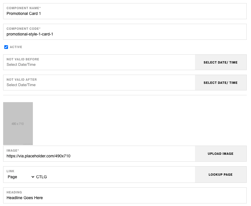
Promotional Card
| Attribute | Description | Required |
|---|---|---|
| Image | The image that will be displayed for the component | Yes |
| Link | The link for the image and CTA button | No |
| Heading | Header text below image | No |
| Text | Text copy below header | No |
| CTA Text | The copy to display in the CTA button | No |
| CTA Style | The style of the CTA button to apply | No |
Notes
Notes
To build Four Across Row make sure to add (4) Promotional Card components as children.
The link input in the Promotional Card component will also be used as the CTA link.
Background color value should be in Hex Code ex. #FFFFFF.
Components can be set to hide or show using Not Valid Before & Not Valid After.
Default
Default
If left unselected, Promotional Card Component's CTA Type defaults to Link style.