Simple Carousel
Summary
A carousel that consists of a Header, products from a chosen category, & CTA. Also has ability to choose how many slides & products to display, select arrows and/or bullets for continue & previous buttons. Click here to see this component live.
Display

Desktop
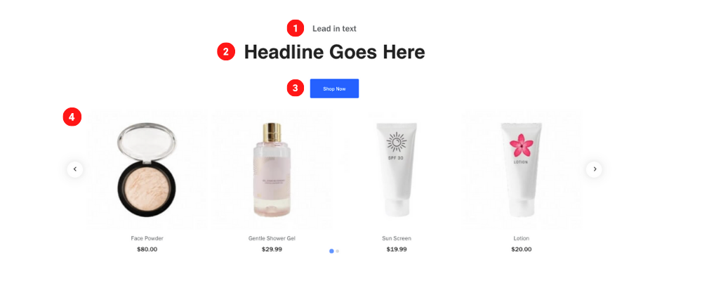 Tablet
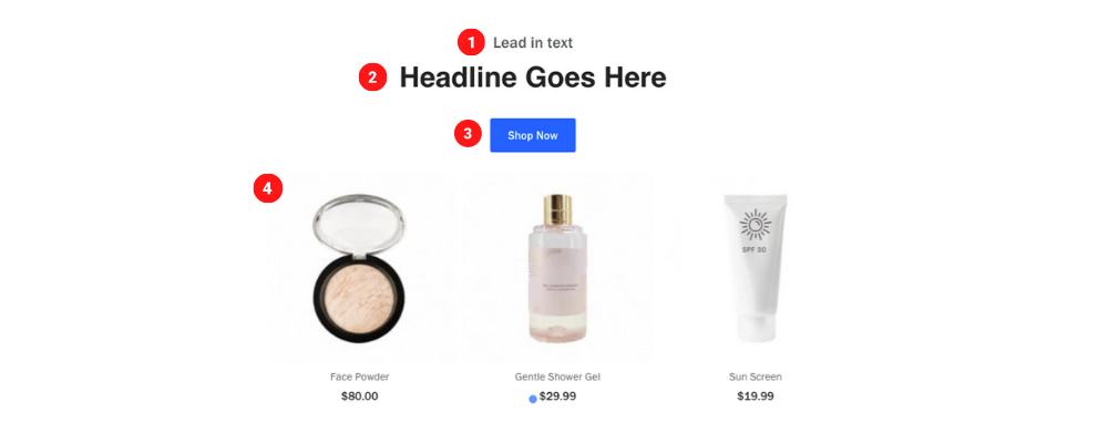 Mobile
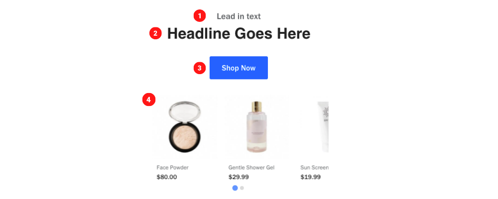
Create Component
Steps:
1. Check layout and click View/Edit Layout.
2. Click + Add New Component.
3. Select Simple Carousel.
4. Enter component name and component code.
5. Set component as Active.
6. Enter following inputs in admin.
Attention
Component code should be unique to each component.
Admin Display
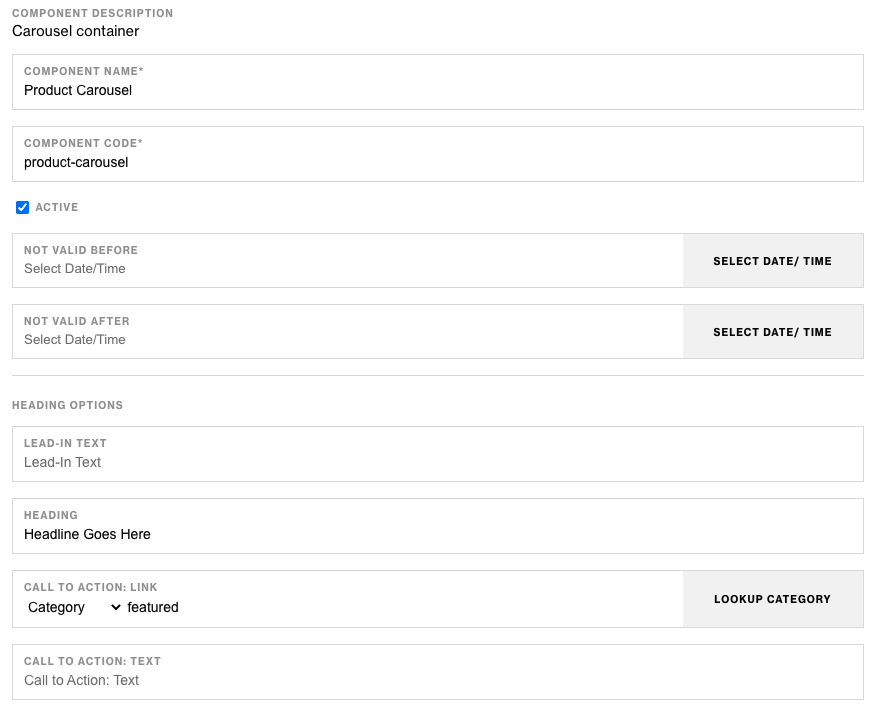
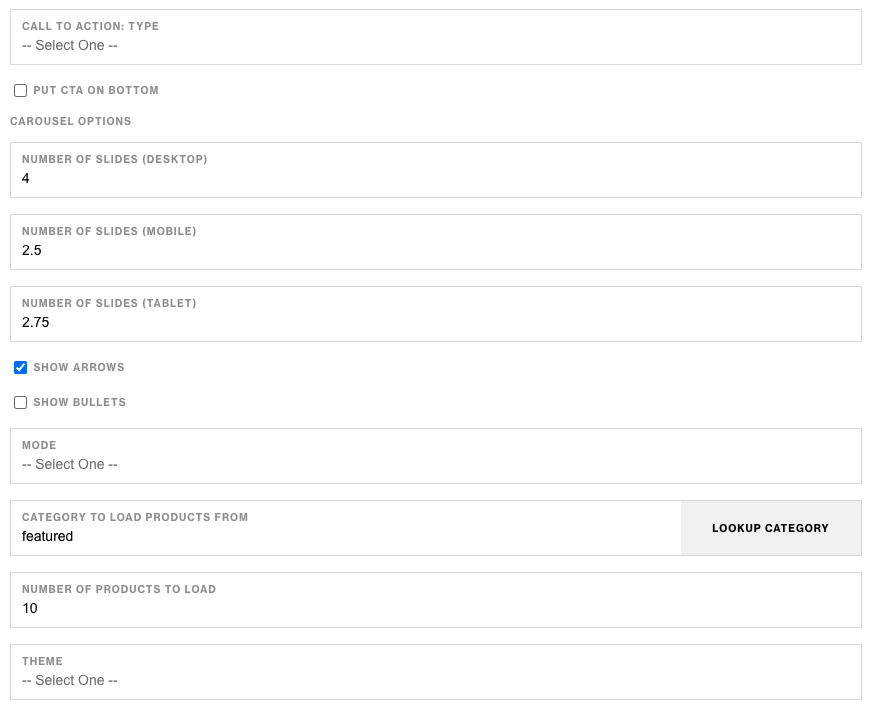
Component Attributes
| Attribute | Description | Required |
|---|---|---|
| Lead-In Text | Text Content at the top | No |
| Heading | Heading below Lead-In text | No |
| CTA Link | CTA button link | No |
| CTA Text | CTA button text content | No |
| CTA Type | CTA button style | No |
| Put CTA On Bottom | Put CTA at the bottom | No |
| Number of Slides (Desktop) | How many slides to display on desktop | No |
| Number of Slides (Tablet) | How many slides to display on tablet | No |
| Number of Slides (Mobile) | How many slides to display on mobile | No |
| Show Arrows | Show or hide left and right arrows | No |
| Show Bullets | Show or hide bullets below slides | No |
| Mode | Center Carousel | No |
| Category To Load Products From | Choose a category to display products from | No |
| Number Of Products To Load | Select how many products to display | No |
| Theme | Change style of carousel | No |
Notes
Notes
To create a peak view for the next product in carousel use percentages ex. 2.5 for number of slides.
Aviod using bullets & CTA on bottom of carousel, this will cause overlap.
Selecting Skinny Theme displays carousel arrows on top of product images creating a smaller width carousel.
Components can be set to hide or show using Not Valid Before & Not Valid After.
Default
Default
If left unselected, CTA Type defaults to Primary.