Tabbed Carousel
Summary
A tabbed carousel layout component is made up of 3 components. These components are the Tabbed Carousel, Tabbed Carousel Tab, & Tabbed Carousel Card. The layout component structure also provides the flexibility to create a Tabbed Carousel component with only Cards, only Products or with both Cards & Products. Click here to see this component live.
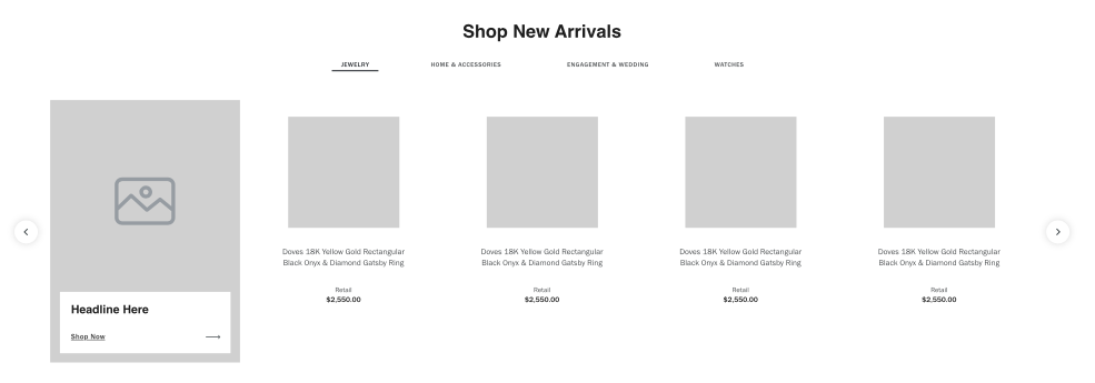
Display
Desktop
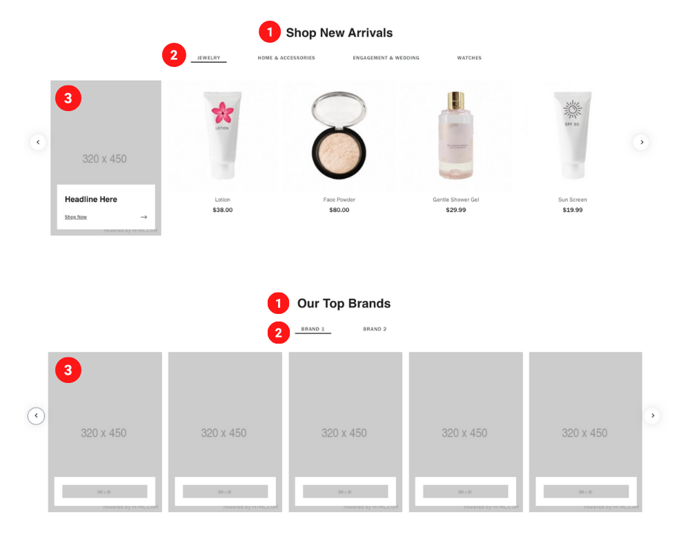 Desktop Image size 320 x 450 pixels & 35 KB
Logo Image size 200 x 30 pixels & 5 KB
Logo Image size 200x30
Tablet
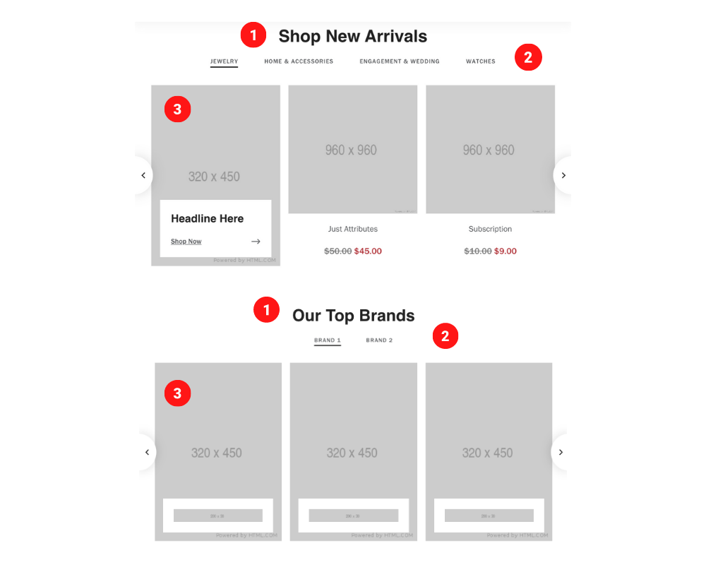 Tablet Image size 320 x 450 pixels & 35 KB
Logo Image size 200 x 30 pixels & 5 KB
Logo Image size 200x30
Mobile
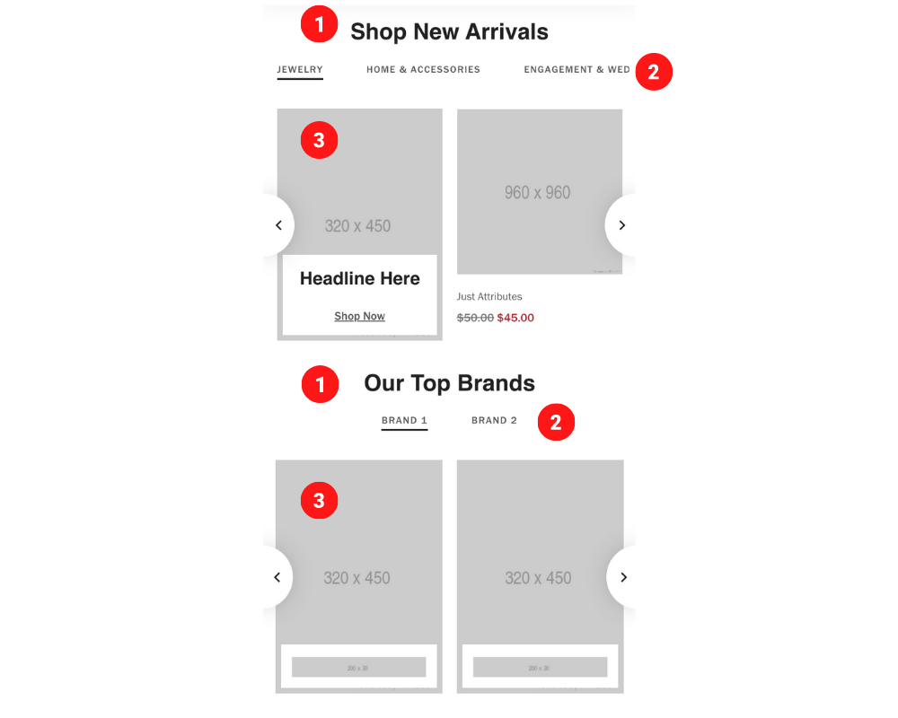 Mobile Image size 320 x 450 pixels & 35 KB
Logo Image size 200 x 30 pixels & 5 KB
Create Component
Steps:
1. Check layout and click View/Edit Layout.
2. Click + Add New Component.
3. Select Tabbed Carousel.
4. Enter component name and component code.
5. Set component as Active.
6. Enter following inputs in admin.
7. Select ••• and click Add Child.
8. Select Tabbed Carousel Tab.
9. Select ••• on Tabbed Carousel Tab and click Add Child.
10. Select Tabbed Carousel Card.
Attention
Component code should be unique to each component.
Admin Display
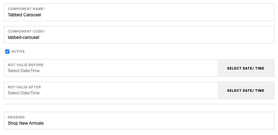
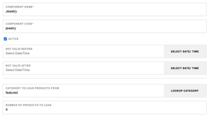
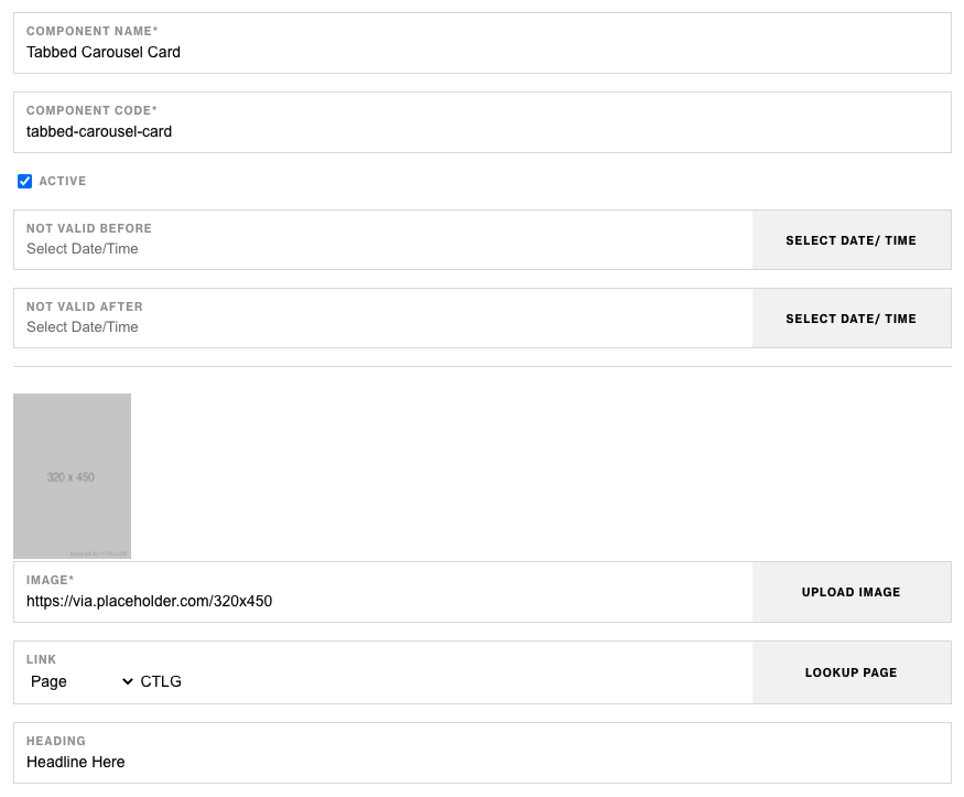

Components & Component Attributes
Tabbed Carousel
| Attribute | Description | Required |
|---|---|---|
| Heading | Heading text at the top | No |
Tabbed Carousel Tab
| Attribute | Description | Required |
|---|---|---|
| Category To Load Products From | Choose a category to display products from | No |
| Number Of Products To Load | Select how many products to display | No |
Tabbed Carousel Card
| Attribute | Description | Required |
|---|---|---|
| Image | Larger image to load in | Yes |
| Heading | Heading below Lead-In text | No |
| Link | Link for the image and CTA button | No |
| CTA Text | CTA button text content | No |
| Logo Image | Lower image | No |
Notes
Notes
Tabbed Carousel Card component has ability to choose between logo image or the heading & CTA text. If both have values, logo image will take precedence. Logo Image Size 200x30
Nesting multiple Tabbed Carousel Cards below Tabbed Carousel Tab will show more cards & less products.
Components can be set to hide or show using Not Valid Before & Not Valid After.
Default
Default