Tall Full Width Banner
Summary
A tall banner component with option to use background color or background image & CTA. Click here to see this component live.

Display
Desktop
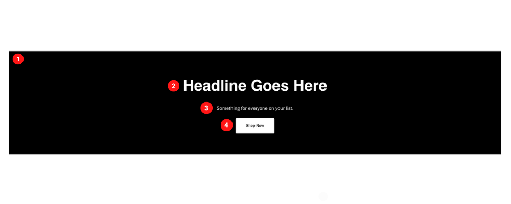 Desktop Image size 1550 x 280 pixels & 95 KB
Tablet
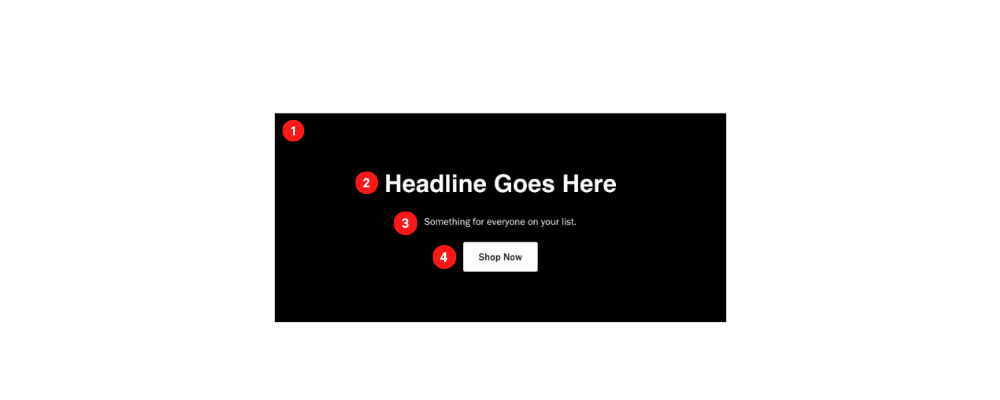 Tablet Image size 730 x 280 pixels & 45 KB
Mobile
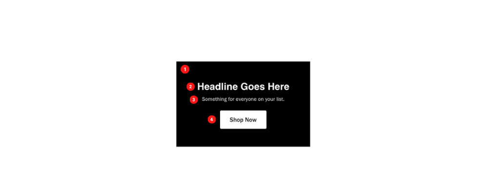 Mobile Image size 360 x 200 pixels & 20 KB
Create Component
Steps:
1. Check layout and click View/Edit Layout.
2. Click + Add New Component.
3. Select Tall Full Width Banner.
4. Enter component name and component code.
5. Set component as Active.
6. Enter following inputs in admin.
Attention
Component code should be unique to each component.
Admin Display
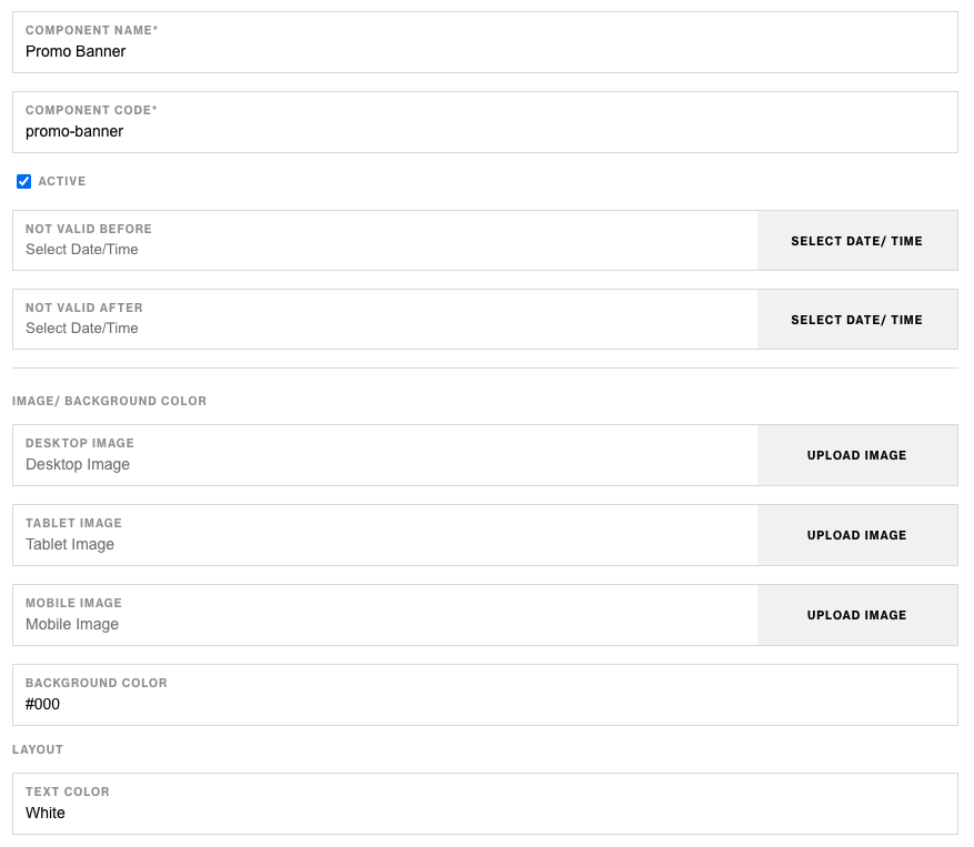
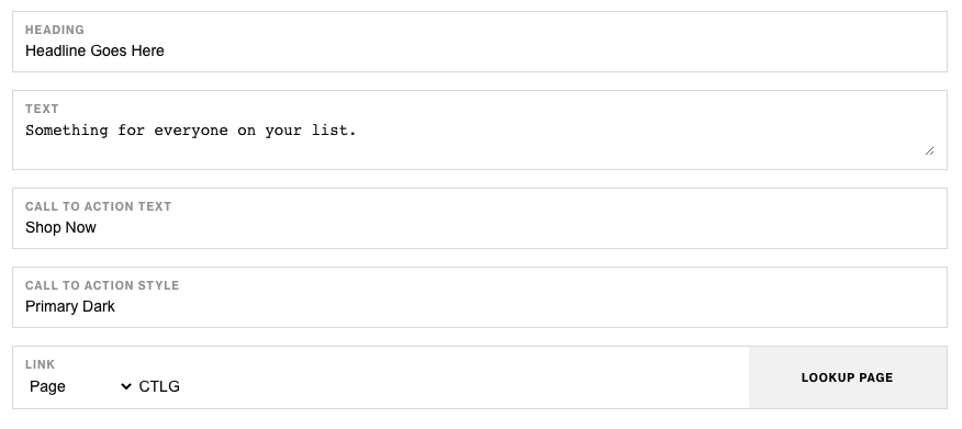
Component Attributes
| Attribute | Description | Required |
|---|---|---|
| Desktop Image | Choose an image for desktop | No |
| Tablet Image | Choose an image for tablet | No |
| Mobile Image | Choose an image for mobile | No |
| Background Color | Choose a background color for container | No |
| Layout: Text Color | Choose a text color | No |
| Layout: Heading | Heading text at the top | No |
| Layout: Text | Text content below heading | No |
| Layout: CTA Text | CTA text content | No |
| Layout: CTA Style | Choose a CTA style | No |
| Layout: CTA Link | Choose a CTA link | No |
Notes
Notes
If both images and background color for the text side has values, color will take precidense over background.
Background color value should be in Hex Code ex. #FFFFFF.
Components can be set to hide or show using Not Valid Before & Not Valid After.
Default
Default
If left unselected, Main CTA Style defaults to Primary Dark.