Text Based Information Block
Summary
An informational component with option to use background color or background image & CTA.It also has ability to reverse layout and add a container for extra padding on larger screens. Click here to see this component live.
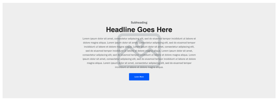
Display
Desktop
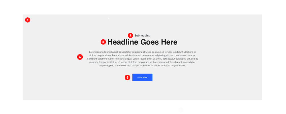
Tablet
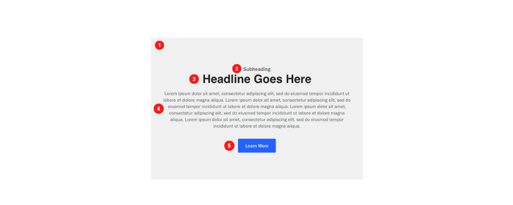
Mobile

Create Component
Steps:
1. Check layout and click View/Edit Layout.
2. Click + Add New Component.
3. Select Text Based Info Block.
4. Enter component name and component code.
5. Set component as Active.
6. Enter following inputs in admin.
Attention
Component code should be unique to each component.
Admin Display
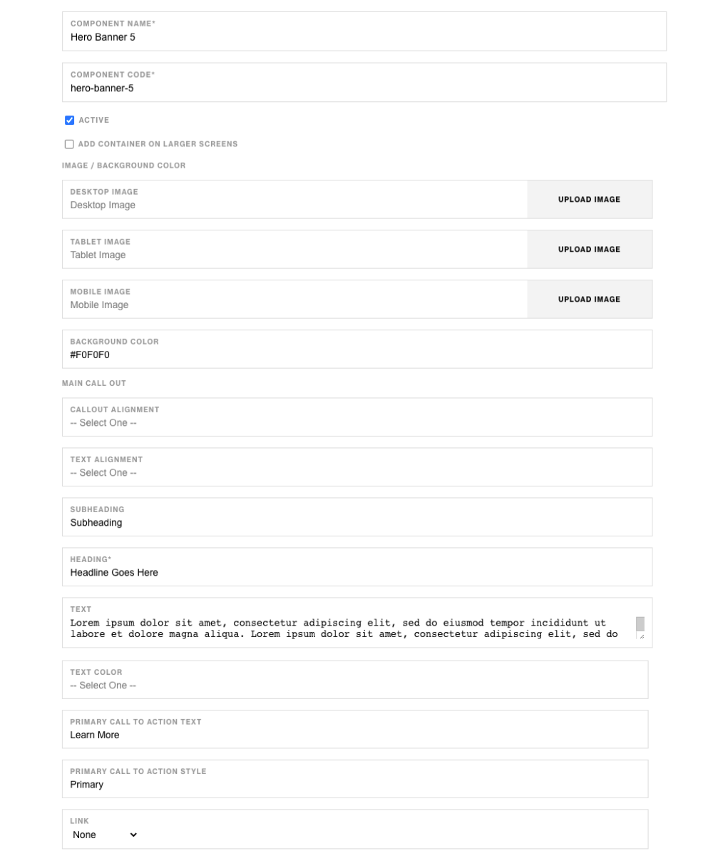
Component Attributes
| Attribute | Description | Required |
|---|---|---|
| Add Container On Larger Screen | Adds a container around the component on larger screens | No |
| Desktop Image | Choose image for desktop | No |
| Tablet Image | Choose image for tablet | No |
| Mobile Image | Choose image for mobile | No |
| Background Color | Add background color | No |
| Call Out Alignment | Align all content | No |
| Text Alignment | Align all text | No |
| Subheading | Text Content at the top | No |
| Heading | Heading below subheading | Yes |
| Text | Larger text content | No |
| Text Color | Choose color for larger text content | No |
| Primary CTA Text | Text content for CTA button | No |
| Primary CTA Style | CTA button style | No |
| Link | CTA button link | No |
Notes
Notes
If both images and background color for the text side has values, color will take precidense over background.
Background color value should be in Hex Code ex. #FFFFFF.
Components can be set to hide or show using Not Valid Before & Not Valid After.
Default
Default
If left unselected, Based Info Block's CTA Style defaults to Primary.